Shrinking window moving average
Most charts on ClimateExplorer show a moving average rather than the raw yearly values. A single year's temperature or rainfall is noisy, and a 20-year moving average (the setting used by most of our presets) smooths the noise so the long-term change is easier to see.
For more than four years the site has used a centred moving average for this. It has a side effect: with a 20-year window, the line stopped ten years before the end of the data. A record that runs to 2025 was charted only to 2015. The most recent years are the ones we are most interested in, and they looked as though they were missing from the chart.
The charts now use a shrinking window moving average, which carries the line through to the last year of data.
First, a fix for even-sized windows
To begin, there is a change to the centred moving average itself.
A centred moving average should have the same number of years either side of the year being plotted. That only works for an odd window size: a 5-year window is the year itself plus two years either side. Strictly, odd numbers should be used. But people like to think in round numbers such as 10, 20 and 30, and an even window can't be centred on a year. A 4-year window has to sit as either 2018–2021 or 2019–2022, and neither has 2020 in the middle.
The centred moving average now handles an even window size by using half weights on the two end years. A 4-year window centred on 2020 reaches two years either side, so it spans five years, with the half weights on 2018 and 2022:
| Year | 2018 | 2019 | 2020 | 2021 | 2022 |
|---|---|---|---|---|---|
| Weight | 0.5 | 1 | 1 | 1 | 0.5 |
The weights add up to 4, so the total is divided by 4:
((0.5 × 2018) + 2019 + 2020 + 2021 + (0.5 × 2022)) ÷ 4
The method is known as a 2×4 moving average, and it is the standard way of centring an even-sized window. It is described in Forecasting: Principles and Practice by Rob Hyndman and George Athanasopoulos (section 3.3, under "Moving averages of moving averages"), where it is called a "centred moving average of order 4". It is the same technique used to average a full year around a month in the de-seasonalisation process for CO₂.
The 20-year windows in the rest of this post work the same way: ten years either side, 21 years in all, with the first and last at half weight.
Why the line stopped early
A centred moving average replaces each year's value with the average of the years around it. For a 20-year window, the value plotted at 2005 is the average of 1995 to 2015: ten years either side.
The value for 2020 would need the years 2010 to 2030, and 2030 hasn't happened yet. So the centred moving average gives no value for 2020, nor for any other year in the last ten. The same thing happens at the start of the record, where the first ten years have nothing before them.
The recent years were always part of the chart: 2025 was included in the average plotted at 2015. But you had to know how a moving average is charted to see that. To anyone else, the chart looked as though it was a decade out of date.
The shrinking window
The shrinking moving average is the same as the centred moving average wherever the full window fits. Near either end of the record, where the full window would run past the data, the window gets smaller so that it still fits.
The idea and the name are borrowed from MATLAB's movmean function, where "shrink" is the default way of handling the endpoints: "Shrink the window size near the endpoints of the input to include only existing elements."
For a 20-year moving average on a record that ends in 2025:
| Year | Years averaged | Window size |
|---|---|---|
| 2015 | 2005–2025 | 20 (full) |
| 2016 | 2007–2025 | 19 |
| 2017 | 2009–2025 | 17 |
| 2018 | 2011–2025 | 15 |
| 2019 | 2013–2025 | 13 |
| 2020 | 2015–2025 | 11 |
| 2021 | 2017–2025 | 9 |
| 2022 | 2018–2025 | 8 |
| 2023 | 2019–2025 | 7 |
| 2024 | 2020–2025 | 6 |
| 2025 | 2021–2025 | 5 |
From 2016 to 2021 the window shrinks evenly on both sides, so it stays centred on the year being plotted. Once it reaches four years either side it stops shrinking on the earlier side. From 2022 onwards the window still reaches back four years, and only the later side is cut off by the end of the data. Without that limit, the value for 2025 would be the single raw value for 2025, with no smoothing at all.
This is where our version differs from MATLAB's. movmean only drops the years that don't exist, so its window keeps all ten earlier years and becomes lopsided as soon as it reaches the end of the data. Ours stays centred for as long as it can.
The start of the record is handled the same way, so the line also begins at the first year of data rather than ten years in.
A worked example
Here is the calculation on a made-up record of thirteen yearly temperatures, using a 12-year moving average. The smaller window keeps the arithmetic short, and the steps are the same as for a 20-year window.
| Year | Temperature (°C) |
|---|---|
| 2013 | 13.6 |
| 2014 | 13.9 |
| 2015 | 13.4 |
| 2016 | 14.1 |
| 2017 | 13.8 |
| 2018 | 14.2 |
| 2019 | 14.6 |
| 2020 | 13.7 |
| 2021 | 13.5 |
| 2022 | 13.3 |
| 2023 | 14.3 |
| 2024 | 14.5 |
| 2025 | 14.0 |
Step 1: the full window (2019). A 12-year window centred on 2019 reaches six years either side, from 2013 to 2025. That is thirteen years, not twelve, so the two end years are counted at half weight, as described above. The weights add up to twelve.
- Half of 2013 and half of 2025: 6.8 + 7.0 = 13.8
- The eleven years from 2014 to 2024, in full: 153.3
- Total: 167.1, divided by 12 = 13.93
2019 is the only year in this short record where the full window fits. The old centred moving average would have plotted this one point and nothing else.
Step 2: shrink the window evenly (2020 and 2021). 2020 has only five years of data after it, so the window reaches five years either side: 2015 to 2025. That is eleven years, each counted in full. Their total is 153.4, and 153.4 ÷ 11 = 13.95.
2021 has four years after it, so the window is 2017 to 2025. Nine years total 125.9, and 125.9 ÷ 9 = 13.99.
Step 3: stop shrinking at four years (2022 to 2025). 2022 has three years after it. Rather than shrinking to three years either side, the window keeps its four earlier years and takes the three later years that exist: 2018 to 2025. Eight years total 112.1, and 112.1 ÷ 8 = 14.01.
The remaining years follow the same rule:
| Year | Years averaged | Window size | Moving average |
|---|---|---|---|
| 2019 | 2013–2025 | 12 (full) | 13.93 |
| 2020 | 2015–2025 | 11 | 13.95 |
| 2021 | 2017–2025 | 9 | 13.99 |
| 2022 | 2018–2025 | 8 | 14.01 |
| 2023 | 2019–2025 | 7 | 13.99 |
| 2024 | 2020–2025 | 6 | 13.88 |
| 2025 | 2021–2025 | 5 | 13.92 |
The years before 2019 are calculated the same way in mirror image, shrinking towards 2013.
Dotted lines and the tooltip
A value averaged over five years is not as smooth as one averaged over twenty. The ends of the line will move around more than the middle does.
To make that visible, a line chart draws the shrinking part of the line as a dotted line. The solid line is the full window, and the dotted line is where the window has shrunk.
The chart tooltip now also reports the window for the point you are hovering over, in two columns. Size is the window size, and Range is the first and last year included in the average.
The range is the only way to tell when the window is no longer centred. In the 20-year table above, 2022 has a size of 8, and its range of 2018-2025 shows that the window reaches four years back but only three forward.
For a full window the range covers one more year than the size: a 20-year average plotted at 2015 has a range of 2005-2025, which is 21 years, because the first and last are counted at half weight.
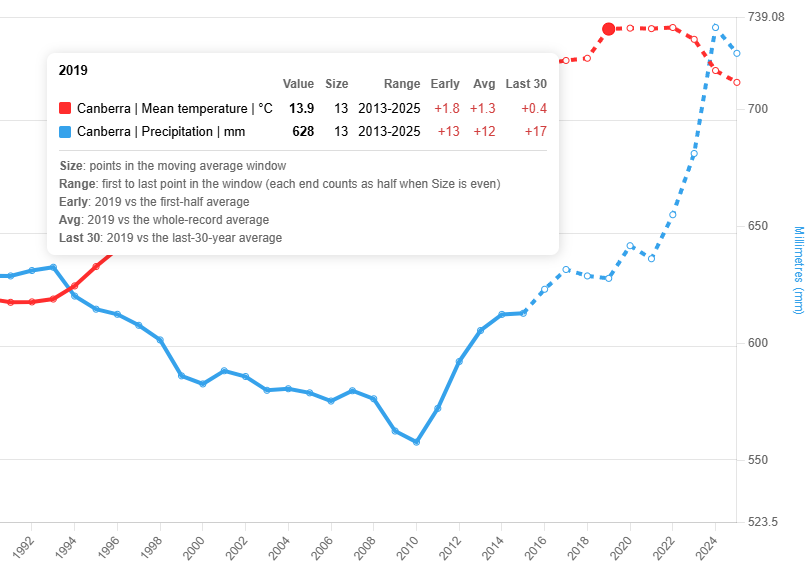
The tooltip for 2019 on a record that ends in 2025. The moving average is set to 20 years, but 2019 has only six years after it, so its window has shrunk to 13. The range, 2013-2025, shows the first and last years included in the average.
The points on the dotted line should be considered preliminary. When the next year of data is added to the site, every one of them will be recalculated over a wider window and will shift a little. A point becomes final once the full window fits around it, which for a 20-year moving average is ten years later.
What it means for trends
A chart with a trend line is affected in two ways.
- The trend calculation now includes the shrinking years. The trend is a linear regression fitted to the moving average, and the moving average now runs to the end of the record. Those end points are less smooth than the rest, so they can pull the trend more than a full-window point would.
- There is no longer a gap before the projection. Previously the moving average stopped ten years short and the projected period began after the last year of data, leaving a break in between. Now the moving average ends where the projection starts.
The first point is a potential weakness. The second makes it much easier to see what the chart is doing. We think it's a reasonable trade-off.
The centred moving average is still there
The shrinking moving average extends the centred moving average more than it replaces it. Wherever the solid line is drawn, the two give the same values.
All the presets have been changed to use the shrinking version. If you'd rather see only full-window values, the original is still available: open a series' options and set Smoothing to Centred moving average.