Chart options information
When using ClimateExplorer, you may notice that below the chart there is a cluster of buttons that allow you to customise the data and the chart. This post explains what they are and how to use them. There is a general help (chart options) and detailed information on two of the more complicated areas. The sections are:
- Chart options
- Year filtering
- Aggregation options
Chart options information

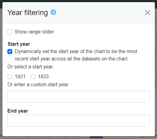
Year filtering: allows you to change the start and end years for the chart. For example, if you want to see the change in temperature for the 20th century, you could set the end year to 2000.
Clear filter: the clear filter button is only displayed when there is a start or end year filter applied to the chart. Clicking this button will reset the chart back to the default filter and remove the range slider (if it has been turned on).
Grouping: the grouping option allows you to look at the data from another point of view. The default view is “Yearly”; i.e., each point on the graph represents a single year in the series. To represent daily data at the yearly level, ClimateExplorer applies rules and aggregations to average (or sum) the data together. If you select “Year + Month” the data will be re-processed, starting with the daily data for the particular year, to present twelve points on the chart per year. This view works best in combination with the range slider. If you select “Month”, the data will be sliced, again starting with the lowest level of the data (usually daily), into only twelve points, one point for every month of the year. The value for each point will be an average (or sum) of the data across all years. This will give you a climatic view of the data for the location, it will not be as useful for viewing the change in the climate over time.
Download data: the download data button allows you to download, as a csv file, the data for the chart you are currently looking at. The button is context sensitive; it’ll download data that applies to the current view. For example, if you are looking at the data as a “Year + Month” grouping, you will get twelve records for each year.
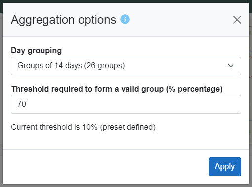
Aggregation options (advanced feature): the aggregation options allow you to change the underlying grouping parameters for the chart. The default values will group the daily data into 14 day (i.e., fortnightly) sub-bins. If each of those sub-bins has records for 70% of those days (i.e., 10 days of the 14 days will need to have records) then the whole year is considered valid. This means that you can still have substantial data loss for the year (e.g., the meteorologist was unwilling to come in on weekends to record the min and max temperatures)
Add data set (advanced feature): the suggested charts at the bottom of the screen provide the user with a number of predefined and recommended charts that can be viewed within ClimateExplorer. Other datasets can be added in an ad-hoc manner with the “Add data set” button. The list on the “Add data set” dialog contains data for your current location, such as solar radiation and the diurnal range for temperature. The list also contains reference data sets that can be added, such as CO₂, ENSO indexes and data from the cryosphere (the cryosphere comprises the parts of the planet that are frozen most of the year).
Year filtering information

This dialog allows you to change the start and end years for the chart. For example, if you want to see the change in temperature/rainfall for the 20th century, you could set the end year to 2000.
Range slider: if you want to browse the start/end years of the chart, the range slider may be helpful. It allows you to the change the range of years on the chart, using a slider control. The range slider supports increasing and decreasing the start and end year individually. By moving the slider within the extents, it will change both start and end years at the same time. For example, you could filter to only 30 years of data, between 1910 and 1940, then move the slider to another set of 30 years, between 1940 and 1970.
Dynamically set the start year of the chart to be the most recent start year across all the datasets on the chart: when this is checked, the start year for the chart will be the last start year found across the datasets. For example, Canberra’s temperature records start in 1914. Canberra’s rainfall records start in 1924. With the option checked, the chart will start in 1924 because that’s the latest start year. The start year for the chart will dynamically adjust to whatever datasets are selected for viewing. This option is checked by default.
Aggregation options information

The aggregation options are advanced features that allows you to change the underlying aggregation process. To calculate a single aggregated value for data for a year, from daily or monthly series, data is bundled together. If each bundle of data does not have enough records, the bundle is rejected as being unreliable.
By default, the bundles are groups of 14 days (fortnights) and each bundle requires 70% (10 days of the 14) of the records to be present for the year to be considered reliable enough for an average mean to be calculated. This means that a number of records can be missing for the year, so long as not too many consecutive days are missing. As temperature (and other climate data) follows cyclic patterns, missing data from a consecutive block is considered to be more untrustworthy than sporadic data missing throughout the year.
Some presets (specifically, the cryosphere reference data – sea ice extent and melt) have a lower threshold applied to them because the data has been curated and considered to be trustworthy enough that more of it can be missing while still not corrupting the results.
If you make changes to these settings and apply them, your settings will take precedence and override any preset specific settings. You can clear this by clicking “Clear override” which would have appeared after you applied your changes.
Day grouping: select groups from weekly, fortnightly, monthly, and half-yearly, amongst other options.
Threshold required to form a valid group (% percentage): this is a percentage of how many records is considered sufficient to form a valid bundle of data.
Apply: save your changes and apply them to the chart. These settings will persist as you change locations and datasets within the application.
Clear override: this will reset the settings back to their default (14 days at 70% threshold). Only appears after applying your settings.