Inside Recent Observations
Every location page on ClimateExplorer has a Recent Observations panel. It gathers the most recent data to show an up-to-date view of your location.
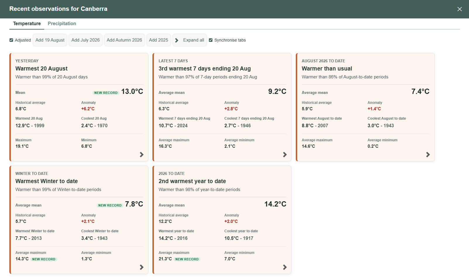
Tiles for every timescale
Recent Observations is a tiled view of a location, one per period: the latest day, the latest 7 days, the current month, the current season, and the year to date.
The panel starts with a default set of tiles, and you can go further back with the "Add" buttons above the grid — add an earlier day, month, season, or year, one at a time.
The headline: ranking
Every tile leads with a plain-English ranking sentence, and it's the fastest way to read whether something is unusual: "Warmer than 85% of 17 August days", "Top 10% warmest", "Warmer than 99% of Winter-to-date periods". This is a straight percentile ranking of the current value against every comparable historical period, i.e. it always compares like with like — this 17 August against every other 17 August on record, this winter-to-date against every prior winter-to-date, and so on.
When a value is at the extreme end of the record, the ranking sentence is replaced by a New record or Equal record badge. Tiles also show the record high and record low for that exact comparison window, with the year they occurred, so a "new record" claim comes with the number it beat right next to it.
Expanding a tile (the chevron in its bottom corner) gives you the full Ranking view: an ordinal rank ("3rd highest of 82"), the comparable-period count it was ranked against, and the record high/low with dates.
Averages and how unusual they are
Alongside the ranking, every tile shows the historical average for that period and the anomaly — how far the current value sits above or below it (e.g. "+3.0°C"). That's the fastest way to see not just whether a period ranks highly, but by how much.
Expanding to the Average tab breaks this down per metric (average mean, maximum, minimum), each with its own anomaly, historical average, and current value.
The Variation tab goes a step further and asks how unusual an anomaly actually is, by expressing it as a standard score against the metric's typical year-to-year spread. A small anomaly in a period that's normally very stable can be more unusual than a larger anomaly in a period that swings around a lot from year to year — the standard score is what separates those two cases, and it's shown alongside the typical variation it was measured against.
Trends
The Trend tab fits a linear regression to the metric's history and reports the rate of change per decade, for three overlapping windows: the full period of record, the most recent 30 years, and the first half of the record. Comparing the three shows whether recent warming is accelerating, holding steady, or actually part of a longer-run trend that predates the recent window.
Each trend line only gets a place if it's statistically significant — where it isn't, the tile says so plainly ("No significant trend") rather than reporting a slope that isn't reliably different from zero. A tooltip on each figure gives the underlying statistics (p-value, R², sample years) for anyone who wants to check the working.
Trends need a reasonably long record to be meaningful, so this tab only appears once there's enough comparable history (the site uses the same 60-year minimum applied elsewhere, e.g. the warming anomaly and heating score) — short records show an explanation instead of a number.
Temperature and precipitation
Everything above is described for temperature, which is the default tab, but the panel has a matching Precipitation tab that applies the same period tiles, ranking, averages, and trend windows to rainfall — wettest/driest instead of warmest/coolest, and totals rather than means. The mechanics are identical; only the vocabulary and the underlying metric change.
Fine-tuning the comparison
A few controls sit above the tile grid and under a "Configuration" section below it:
- Adjusted, where available, toggles between adjusted temperatures (corrected for things like station relocations) and raw measurements.
- View as of lets you set a reference date, so you can see what Recent Observations would have shown on any past day, not just today.
- Comparison range chooses whether historical comparisons use the station's entire dataset or only data up to that reference date.
- Completeness threshold sets the minimum proportion of a period's days that must have data before it's compared to history at all, so a month missing half its readings doesn't get ranked as if it were complete.